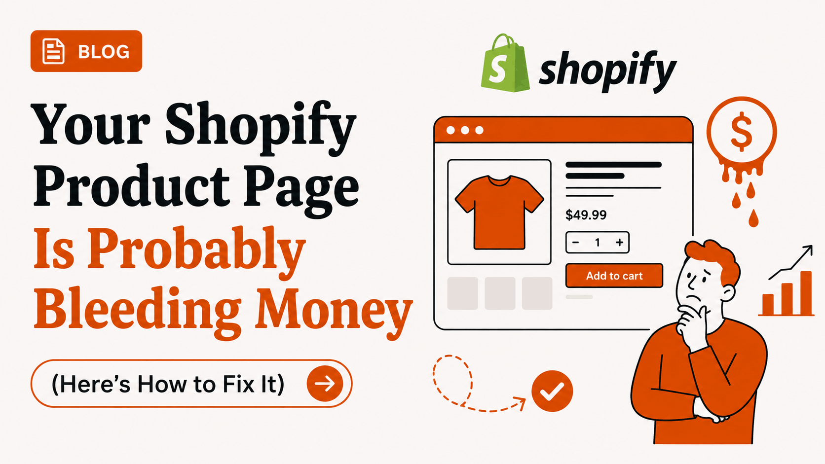
Your Shopify Product Page Is Probably Bleeding Money (Here's How to Fix It)
The homepage doesn't sell anything. Your product page does. And most Shopify stores treat theirs like an afterthought, which is, frankly, a bit mad given it's where the money actually changes hands.

TL;DR: The homepage doesn't sell anything. Your product page does. And most Shopify stores treat theirs like an afterthought, which is, frankly, a bit mad given it's where the money actually changes hands. Naff descriptions copy-pasted from suppliers. Photography that looks like it was shot in 2014. Zero testing, zero curiosity about what's actually working. Sort the fundamentals first (proper images, a bit of video, social proof people will actually believe, a sticky CTA that doesn't disappear on mobile), then rewrite your descriptions so they sound like a human wrote them, because, well, a human should. Then? Stop guessing. Run real tests with something like SplitSense instead of redesigning on a hunch and hoping. The wins are rarely dramatic on their own. They compound. A 3% lift here, a 5% lift there, and suddenly you're looking at a meaningfully different P&L by the end of the quarter.
Key points:
- Customers decide whether to stay on a product page within about 8 seconds — every element above the fold matters
- Photography, video, social proof, visible delivery info, and a sticky add-to-cart button are non-negotiable
- Product descriptions should make readers feel something first, answer practical questions second, list specs last
- Best practices are starting points — actual conversion lifts come from A/B testing on your audience
- SplitSense lets you test product page elements (images, copy, CTAs, layout) without developer setup
- Test one element at a time, in order of impact: hero image → headline → CTA → trust signals → description → pricing
Let's be honest. Most product pages are a graveyard for conversions.
You've spent ages on the homepage. Tweaked the hero banner. Argued with your designer about whether the "Shop Now" button should be navy or that slightly different navy. Meanwhile, the actual page where people decide whether to part with their hard-earned cash? It's sitting there with three blurry photos, a description ripped straight from the manufacturer, and a single review from someone's mum.
Here's the thing nobody quite says out loud: the product page is where the sale happens. Not the homepage. Not the collection page. The product page. It's the till. And if yours is faffing about with stock photos and a wall of grey text, well — you're essentially asking customers to leave.
So let's talk about how to fix that. Properly.
Why Product Pages Punch Above Their Weight
Think about how people actually shop. Someone clicks an Instagram ad, lands on a product page, and within roughly eight seconds decides if they're staying. Eight. Seconds. That's barely enough time to find your keys.
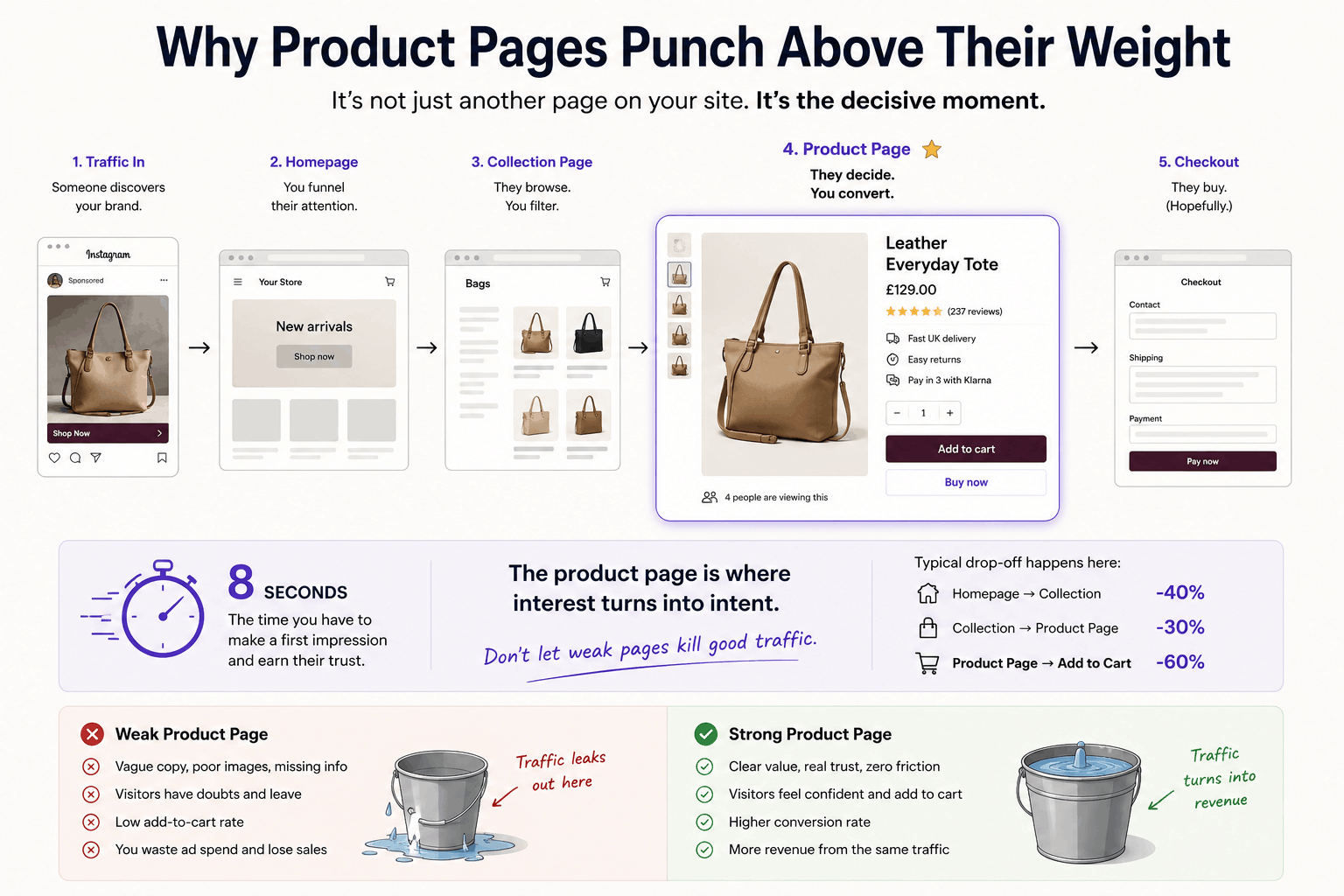
Every other page on your store is essentially a corridor leading here. The homepage exists to funnel traffic. Collection pages exist to filter intent. But the product page? That's where someone goes from "hmm, that's interesting" to "right, where's my card." It's the bit that has to do all the heavy lifting — and if you've ever stared at your analytics wondering why your add-to-cart rate is shockingly low despite decent traffic, this is almost certainly where the leak is.
I reckon a lot of Shopify merchants underestimate just how much real estate the product page covers in the customer's mental journey. It's not one page. It's the page.
The Elements That Actually Enable You To Convert
Right, let's get into specifics. There's a load of generic advice floating about online ("use good photos!" thanks, brilliant insight), but here's what genuinely shifts conversions based on what works in practice:
Photography that doesn't lie. Multiple angles, lifestyle shots, scale references, zoom functionality. If you sell a bag, show someone wearing it. Show what fits inside. Show the texture close enough that people can almost feel the leather. One photo on a white background is not a product page, it's a cry for help.
Video. Seriously, video. A 15-second clip of the product being used can outperform six static images. Doesn't need to be cinematic. A phone-shot demo is often better than something over-produced, feels real, feels honest.
Social proof, but the right kind. Star ratings up top near the title. Reviews with photos lower down. User-generated content stitched in throughout. Trust badges if you're a smaller brand. Press mentions if you've got 'em. Nothing kills hesitation quite like seeing another normal human use the thing and not regret it.
A delivery promise that's actually visible. "Free UK shipping over £40" or "Dispatched same day if ordered before 2pm", these belong above the fold, not buried in a footer link nobody clicks.
Hot tip, make sure that you include shipping in the price of the product and then offer free shipping, this will increase conversions by removing customer friction. Nobody likes paying for shipping!
An FAQ section right there on the page. Sizing. Materials. Returns. Care instructions. If they have to leave the page to find an answer, you've lost them. They will not come back. Sad but true.
Sticky add-to-cart button on mobile especially. Mobile conversion rates lag behind desktop on most stores and a lot of it comes down to people scrolling, getting interested, and then losing the button into the scroll abyss.
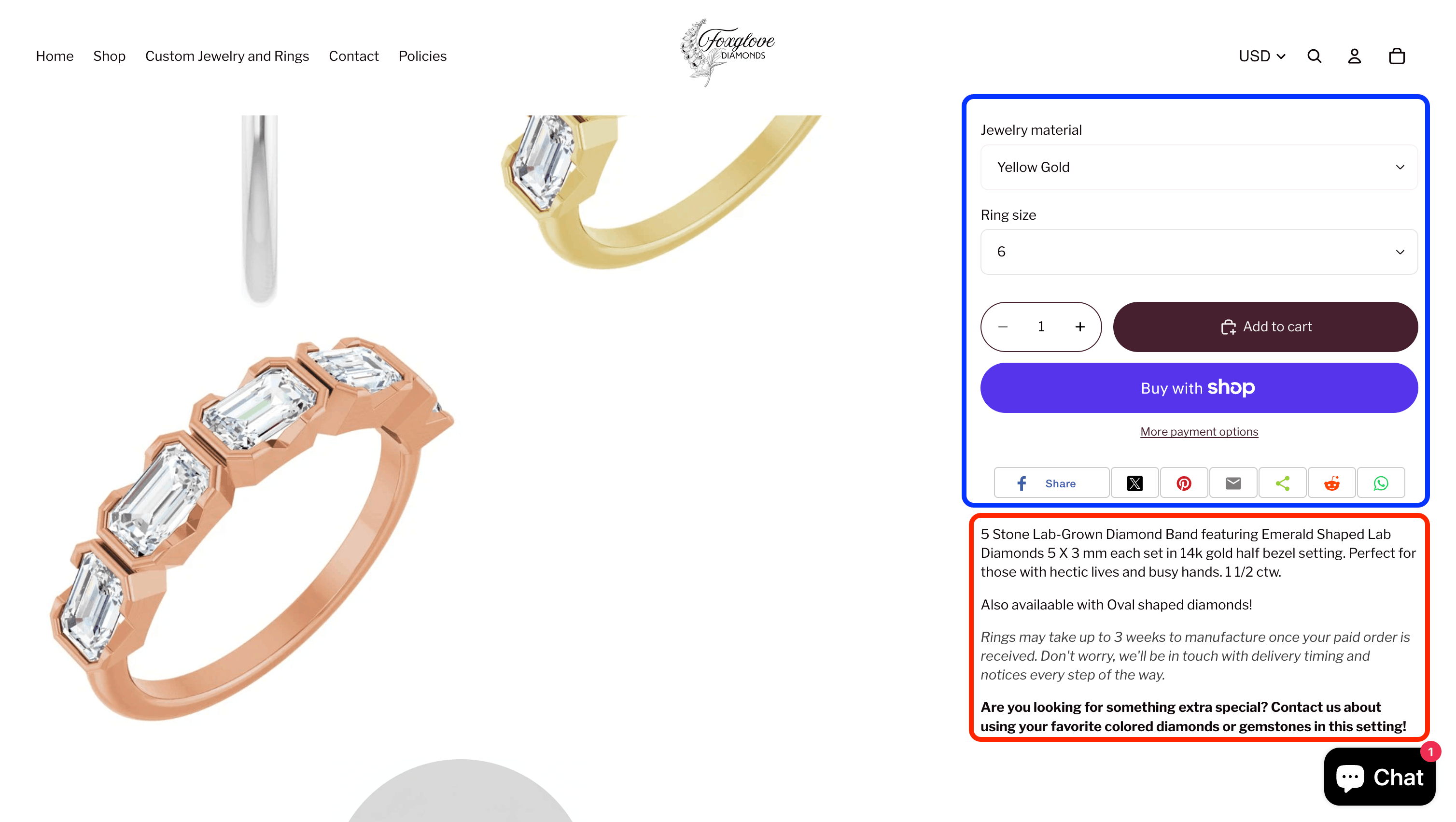
The example above was pulled from r/reviewmystore on reddit. Its a perfect example of a really poor product page. It contains zero of the mentioned elements, a good place to put social proof ect is somewhere in the blue box above and has a really poor product description(red box). He could really benefit from installing some shopify apps in this space to help increase conversions.
Product Descriptions Is Where Most Stores Fall Apart
Most product descriptions read like they were written by a tired intern at 4pm on a Friday, who is fully ready to go and have three beers with a colleague.
"Premium quality cotton t-shirt with excellent durability and comfortable fit."
What does that even mean? Premium according to whom? Durable how? Comfortable for whom?
A good product description does three things, and it does them in this order: it makes the reader feel something, it answers the practical question lurking in their mind, and then, and only then, it lists the spec.
So instead of "100% cotton t-shirt, machine washable, available in five colours," try something like: "The kind of t-shirt you'll grab without thinking on Tuesday mornings. Heavyweight cotton that doesn't go see-through after three washes (we've tested this — extensively). Five colours, but the rust is the one everyone keeps coming back for."
See the difference? One is information. The other is a tiny story.
A few rules I'd stick to:
- Write like you're explaining it to a mate down the pub, then tidy it up slightly
- Front-load the benefit, not the feature, "stays warm in proper winter weather" beats "350 GSM fleece lining"
- Specifics beat superlatives. "Lasted 800 wears in our test" lands harder than "incredibly durable"
- Cut every other adjective. You almost certainly don't need both "luxurious" and "premium"
Oh, and for the love of god, vary the structure across your range. If every product description follows the same template, customers feel it even if they can't articulate why. Mix short punchy descriptions with longer narrative ones depending on the product.
Example Of A Good Product Description & Page
Now, given what we have just discussed, here is a much, much better version of the same page we looked at above. It's not perfect, but its much better and will guarantee a high percentage of conversions.
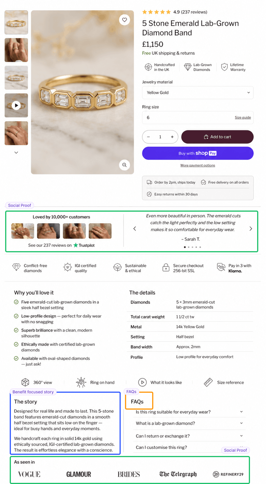
Highlighted in green you can see excellent social proof, reviews and validation. In orange a well thought out FAQs section to answer a customers questions and remove friction. Finally in blue a well crafted product description as a story.
You'll also notice a cleaner layout.
Testing Things Properly Instead of Just Guessing
Here's where most merchants go wrong. They redesign their product page, launch it, see if conversions go up, and call it a day. That's not testing. That's vibes.
Proper A/B testing is the only way to know what actually works on your audience, because your audience isn't the same as someone else's. What converts beautifully for a Brooklyn skincare brand might tank on a Sheffield homeware shop. Best practices are starting points, not gospel.
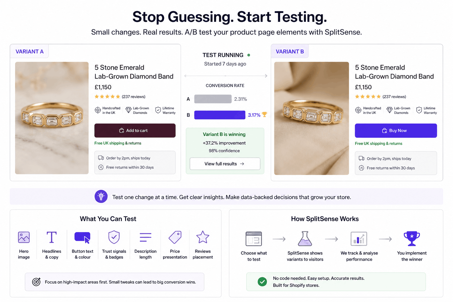
This is where SplitSense comes in handy. It's a Shopify app built specifically for testing things like product page elements, headlines, button copy, image order, description length, price formatting, you name it. You install it, set up a test (swap "Buy Now" for "Add to Bag" and see what happens, for instance), and it'll run statistical analysis in the background while you get on with the rest of your life.
The bit I like is that you can test fairly granular stuff without needing a developer to set up tracking pixels and event listeners and all the rest of it. Want to know if a lifestyle hero image converts better than a flat-lay? Test it. Curious whether adding a urgency message ("only 4 left") helps or feels naff? Test it. Wondering if the reviews block should sit above or below the description? Test it.
Things worth running tests on, in roughly the order I'd attack them:
- The hero image — biggest visual real estate, biggest impact
- Headline and subheadline copy — small changes here, big effects
- Call-to-action button text and colour — classic for a reason
- Trust signal placement — reviews, badges, shipping info
- Description length and format — long-form vs bullet points
- Price presentation — with/without strikethrough, instalment options
One thing worth flagging, don't test everything at once. You'll have no idea what caused the change. Patience, grasshopper. Run one test, learn from it, then move on.
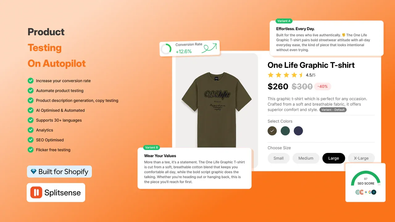
Increase your stores revenue and conversion rate effortlessly, right now, by installing our A/B testing app that automates optimisation for your product descriptions, ensuring that you convert as much of your traffic as possible.
A Final Thought
Product pages are weirdly emotional things. They have to convince someone that this object, sitting on a screen, is worth real money, and that you, an unknown shop on the internet, can be trusted to deliver it. That's a lot to ask of a webpage.
The good news? Most of your competitors haven't bothered to optimise theirs properly either. Which means the bar is genuinely quite low, and the merchants who put in the work, better photography, descriptions that read like a human wrote them, actual testing rather than guesswork, tend to pull away from the pack fairly quickly.
So go have a look at your top three product pages. Be honest with yourself. Where's the weakest link? Start there.