SaaS Landing Page Best Practices: 14 Proven Tips (2026)
Triple your SaaS conversions with 14 data-backed landing page fixes. Learn how top performers hit 11.6%+ and close the 3x gap, no bigger budget required.

TL;DR
The median SaaS landing page converts at 3.8%, while the top 25% hit 11.6% or higher, three times the results from similar traffic. The gap comes down to specific, testable changes, not bigger budgets. This guide covers 14 SaaS landing page best practices backed by data from 41,000+ landing pages and 57 million conversions, with exact implementation steps and real practitioner insights to help you close that 3x gap.
Why Most SaaS Landing Pages Underperform
Somewhere between writing the headline and pressing publish, most SaaS landing pages lose their visitors.
The data makes the problem concrete. According to Unbounce’s analysis of 57 million conversions across 41,000 landing pages, the median SaaS landing page converts at 3.8%. The top 25% of SaaS pages convert at 11.6% or higher. Same industry, same traffic sources, three times the results.
That gap matters more than it looks. Moving a landing page from 4% to 6% conversion lifts revenue by 50%. For a SaaS company spending $50,000 a month on paid acquisition, that’s an extra $25,000 monthly without touching ad spend.
This article covers 14 SaaS landing page best practices, each backed by conversion data and practitioner experience. These aren’t generic design tips. They’re the specific changes that separate median performers from top-quartile results.
Before working through the list, it’s worth knowing where you stand right now. You can run a free landing page audit to score your page against many of the criteria below.
At-a-Glance: Best Practices Ranked by Conversion Impact
Best Practice | Typical Conversion Lift | Effort Level |
|---|---|---|
Single CTA focus | +266% | Low |
Personalized CTAs | +202% | Medium |
Reduce form fields (11 → 4) | +160% | Low |
Embed video or interactive demo | Up to +86% | Medium |
Simplify reading level (5th–7th grade) | +56% | Low |
Add customer testimonials | +34% | Low |
Show visible pricing | +20–30% | Low |
Ad-to-page message match | +15–25% | Medium |
Display review badges (G2, Capterra) | +15–22% | Low |
Remove navigation links | +16–28% | Low |
1. Nail Your Value Proposition in 5 Seconds
Every visitor sees your hero section. That makes it the highest-value real estate on the entire page. Within 5 seconds, a visitor should be able to answer three questions: Where am I? What can I do here? Why should I care?
Most SaaS pages fail this test. After analyzing over 100 SaaS websites, a practitioner on Indie Hackers reported that the most common failure is visitors being unable to answer these basic questions within 5 seconds of landing. The problem is almost always the same: the headline describes features instead of outcomes.
How to implement:
- Write your headline around the outcome your customer wants, not the product category you compete in. “Close deals 40% faster” beats “AI-powered CRM software.”
- Include a subheadline that clarifies how you deliver that outcome.
- Place a product screenshot or short demo clip in the hero so visitors can see, not just read.
- Test specificity in your messaging. One founder discussed on Reddit switched from targeting “CRM software” to “CRM for real estate agents” and saw conversion rates jump dramatically, even with lower search volume. Niche beats broad.
Watch out for this: If you’re running paid campaigns, your value proposition needs to match your ad copy word for word. An exact ad-to-landing page message match lifts conversions by 15–25% for high-intent paid traffic. A generic hero section bleeds money when traffic comes from specific ad groups.
2. Write at a 5th–7th Grade Reading Level
This is the most underused SaaS landing page best practice, and the data behind it is striking.
Unbounce’s research found that pages written at a 5th–7th grade reading level convert at 11.1%. That’s 56% better than pages at an 8th–9th grade level and more than double the 5.3% conversion rate of professional-level writing. Separately, pages using overly advanced vocabulary see a 24% drop in conversion rates.
This runs counter to how most B2B SaaS marketers write. There’s a persistent belief that sophisticated buyers need sophisticated language. The data says the opposite.
How to implement:
- Run your page copy through the Hemingway App or a readability checker. Aim for grade 6–7.
- Replace multi-syllable words with simpler alternatives. “Utilize” becomes “use.” “Facilitate” becomes “help.”
- Cut sentences longer than 20 words in half.
- Use active voice. “Our platform reduces churn” beats “Churn is reduced by our platform.”
- Structure your message with proven copy frameworks like PAS (Problem-Agitate-Solution) or AIDA (Attention-Interest-Desire-Action) to keep benefits front and center.
If you want a faster starting point, the Splitsense free copy generator creates landing page copy using these conversion frameworks automatically.
Watch out for this: Writing simply doesn’t mean writing vaguely. You still need specific claims and concrete numbers. “Save 10 hours a week on reporting” is simple and specific. “We help streamline your workflow” is simple and useless.
3. Use One CTA (and Make It Count)
This might be the single highest-impact change you can make. HubSpot research found that reducing the number of CTAs to a single CTA increased conversion rates by 266%.
The logic is straightforward. Every additional CTA creates a decision point. Decision points create friction. Friction kills conversions. When your page asks visitors to “Start a free trial,” “Book a demo,” “Download the whitepaper,” and “Watch the webinar,” you’re not offering choice. You’re offering confusion.
How to implement:
- Choose one primary action per landing page. For most SaaS pages, that’s either “Start free trial” or “Book a demo.”
- Repeat that same CTA at multiple scroll depths (hero, mid-page, bottom), but keep the action identical.
- Use action verbs that communicate value: “Get,” “Start,” “Book,” “Try.” Avoid passive phrasing like “Learn more” or “Submit.”
- Make the button contrast strongly against the page background. There’s no universal “best color” for CTA buttons, but you need at least a 4.5:1 contrast ratio against the surrounding area.
- Test placement. One practitioner reported that repositioning the primary CTA from mid-page to above the fold yielded a 28% lift in demo bookings on a fintech SaaS project.
Watch out for this: HubSpot’s data also found that personalized CTAs (which change based on visitor segment or behavior) convert 202% better than generic ones. The principle isn’t “one CTA forever.” It’s “one CTA per visitor, per page.” If you have the traffic and tooling to personalize, do it.
4. Remove Navigation and Exit Routes
If your landing page has one goal, give visitors only two options: take action or leave. Every navigation link, footer menu, and “check out our blog” link is an escape hatch.
HubSpot tested this directly and found that removing top navigation increased conversions by up to 28% on middle-of-funnel landing pages. VWO documented a case where the e-commerce site Yuppiechef removed its navigation menu and doubled conversions.
How to implement:
- Strip the main navigation bar from dedicated landing pages, especially those receiving paid traffic.
- Remove footer links or reduce them to the legal minimum (privacy policy, terms of service).
- Audit every link on the page. If it doesn’t move the visitor toward your CTA, cut it.
- Keep social media icons off the page entirely. They’re exit routes disguised as engagement.
Watch out for this: This applies primarily to dedicated campaign landing pages, not your homepage or product pages that serve multiple visitor intents. For SEO-driven pages, navigation aids crawlability and multi-intent user experience. Know which type of page you’re building.
Get started with Splitsense, an Agentic CRO agent that opitmises your website for conversions on autopilot
5. Layer Social Proof Strategically
Customer testimonials increase conversions by 34%, and displaying third-party review badges from platforms like G2 or Capterra lifts conversions by 15–22%. But where you place social proof matters as much as whether you have it.
Talia Wolf of GetUplift puts it well: most SaaS marketers “miss out on strategy, emotion, persuasion, and most importantly, creating a customer-centric landing page.” Social proof is where emotion enters the picture. A specific, detailed testimonial from someone your prospect identifies with does more persuasion work than any headline.
How to implement:
- Use a layered approach: a subtle metric or star rating in the hero section, customer logos just below the fold, and detailed testimonials mid-page.
- Make testimonials specific. Include full names, professional headshots, job titles, and quantified results. “We reduced churn by 23% in 90 days” beats “Great product, highly recommend.”
- Video testimonials outperform text testimonials by 80–86%. Even a 30-second clip of a real customer carries more weight than paragraphs of written praise.
- One agency A/B tested testimonial specificity and found that adding concrete details increased conversions by 18.7%.
- Multiple founders in community discussions cite adding social proof (even Product Hunt badges or user count stats) as the single biggest conversion lift they’ve experienced.
Watch out for this: Fake or generic-looking testimonials backfire. Stock photos, first-name-only attribution, and vague praise read as manufactured. Three authentic testimonials beat twenty fake ones every time.
6. Optimize Page Speed (Every Second Costs 7% of Revenue)
A 1-second delay in page load time reduces conversions by 7%. For a SaaS business generating $1 million monthly through its landing pages, each second of additional load time costs roughly $70,000.
The data is remarkably consistent. Pages loading in under 1.5 seconds convert 2.4 times better than pages loading in 4 seconds. Google’s research shows that 53% of mobile users abandon sites that take more than 3 seconds to load. And a 0.1-second improvement in load speed can increase conversions by 8–10%.
How to implement:
- Compress images using WebP or AVIF formats instead of PNG or JPEG.
- Lazy-load anything below the fold.
- Minimize JavaScript and remove unused third-party scripts.
- Use a CDN to serve assets from edge locations close to your visitors.
- Target a Largest Contentful Paint under 2.5 seconds and test with Google PageSpeed Insights.
Watch out for this: Speed optimization has diminishing returns below about 1 second. Don’t sacrifice functionality (like an interactive demo or video) to shave 200ms off an already-fast page. The conversion lift from a product video can far exceed the cost of slightly longer load time.
7. Design Mobile-First
Mobile devices drive 82.9% of web traffic, yet desktop still converts roughly 8% better. This performance gap represents millions in lost revenue for SaaS companies that treat mobile as an afterthought.
The gap is closeable. Mobile-friendly landing pages (those actually designed for mobile, not just made responsive) achieve 11–12% conversion rates compared to around 10% for desktop-focused pages. Among the highest-converting SaaS landing pages, 86% are truly optimized for mobile.
How to implement:
- Design for the smallest screen first, then scale up. This forces ruthless content prioritization.
- Make CTA buttons at least 48px tall and full-width on mobile.
- Stack content vertically. Side-by-side layouts that work on desktop become unreadable on phones.
- Replace hover interactions with tap-friendly alternatives.
- Test form completion on actual phones, not just browser emulators. Typing on a phone is harder than on a keyboard, making form field reduction (see practice #8) even more critical on mobile.
Watch out for this: “Mobile-first” doesn’t mean “mobile-only.” If your SaaS product targets enterprise buyers, a significant chunk of high-value traffic still comes from desktops during work hours. Check your analytics before assuming your traffic split matches the global average.
8. Minimize Form Fields
Reducing form fields from 11 to 4 increases conversions by 160%. Each field you remove eliminates a decision point and reduces the perceived effort of converting.
The average SaaS landing page form now has 4–5 fields, with the most aggressive pages asking for just an email address. Every year, the bar drops lower as SaaS companies realize that qualifying leads after capture is more efficient than qualifying them during capture.
How to implement:
- Ask only for what you need to start the relationship. For a free trial, that’s usually name and email. For a demo request, add company name.
- If you genuinely need more information, use multi-step forms that break the process into 2–3 short stages. These consistently outperform single long forms.
- Pre-fill fields when possible using UTM parameters, cookies, or enrichment tools.
- Remove CAPTCHA if your spam volume is manageable. Every friction point costs conversions.
Whether you’re optimizing a SaaS signup page or an e-commerce storefront, the same form-reduction principles apply, though the specific fields differ.
Watch out for this: There’s a real tradeoff between conversion volume and lead quality. A one-field form captures more leads but more unqualified ones. Find the minimum viable form for your sales process, not the absolute minimum possible.
9. Show Your Product (Not Just Talk About It)
Embedding video on landing pages can increase conversions by up to 86%, and 30% of top-performing landing pages incorporate video. But the bigger shift happening in 2026 isn’t video, it’s interactive product demos.
As one agency put it, “Book a Demo” is the equivalent of asking someone to marry you on the first date. Prospects want to experience product value before committing to a sales call. After embedding an interactive demo, one SaaS company saw their conversion rate improve by 81%, while demo request quality also improved because prospects arrived pre-educated.
How to implement:
- At minimum, include a product screenshot or animated GIF in the hero section.
- A short product walkthrough video (60–90 seconds) placed mid-page bridges the gap between curiosity and commitment.
- Interactive demos (using tools like Navattic, Storylane, or Supademo) let visitors click through your product without signing up.
- The data supports this strongly: 83% of consumers say they’ve been convinced to buy after watching a brand’s video.
Watch out for this: Auto-playing video with sound is a conversion killer. Let users choose to play. And if your demo video exceeds 2 minutes, most visitors won’t finish it. Keep it tight.
10. Address Objections Before They Kill Conversions
A visitor who scrolls past your testimonials, past your features section, and lands on your FAQ has high purchase intent. They’re looking for a reason to say yes, but something is holding them back. Your job is to answer that objection before they leave to “think about it.”
One of the most effective SaaS landing page best practices for bottom-of-page optimization is pricing transparency. Adding visible pricing increases conversion by 20–30% and, according to Forrester research, reduces sales cycles by up to 30%. Hiding pricing doesn’t create mystique. It creates suspicion.
How to implement:
- Add an FAQ section that addresses the 5–7 most common objections your sales team hears. Security, integrations, onboarding time, contract flexibility, and data migration are the usual suspects for SaaS.
- If your pricing is competitive, display it proudly. If pricing requires context, show starting prices with a “talk to sales for enterprise” option.
- Include a money-back guarantee or “cancel anytime” statement near the CTA. Risk reversal directly addresses the “what if it doesn’t work” objection.
- Place trust badges (SOC 2, GDPR compliance, uptime guarantees) near the form or CTA.
Watch out for this: Don’t address objections your visitors don’t actually have. Survey your lost leads or analyze sales call recordings to find the real blockers. Guessing at objections can introduce doubts that weren’t there before.
11. Match Your Message to Your Traffic Source
This is one of those SaaS landing page best practices that gets discussed often but rarely executed well. An exact ad-to-landing page message match (using identical language between the ad and the headline) lifts conversions by 15–25% for high-intent paid traffic.
Unbounce tested dynamic headline replacement, where the landing page headline automatically matches the searcher’s keyword, and saw conversions to trial increase by 31.4% over a 77-day test with 1,274 visits.
Here’s an emerging angle worth watching: AI search referral traffic converts 22% higher than traditional organic search traffic (3.49% vs. 2.86%). Users arriving from AI search engines carry higher intent because the AI has already narrowed their options before the click. Your landing page needs to match that pre-qualified specificity.
How to implement:
- Create dedicated landing pages for each major ad group or campaign, not one generic page for all traffic.
- Mirror the exact language from your ads in the landing page headline.
- For organic traffic, align your H1 with the primary search intent of the keyword you’re targeting.
- Use dynamic text replacement tools to swap headline copy based on UTM parameters.
- If you need to generate multiple copy variants for different traffic sources quickly, an AI-powered copy generator can produce variations matched to specific campaign angles.
Watch out for this: Message matching doesn’t mean creating hundreds of landing pages. Start with your top 3–5 traffic sources by volume and build from there.
12. A/B Test Continuously (or Automate It)
Here’s the uncomfortable truth about A/B testing: only 13% of A/B tests produce a statistically significant winner. Across more than 28,000 tests analyzed in 2026, 9% produced a significant loss and 78% were inconclusive. Most teams running untargeted tests burn traffic for months with little to show for it.
The alternative isn’t to stop testing. It’s to test smarter. Thinkific tested over 700 landing pages and achieved more than 150,000 conversions in under 2 years. The lesson: volume of testing, not perfection of individual tests, drives results. In one combined headline-plus-button-color test, they saw a 56% improvement in click-through rate with 98% statistical significance.
High-performing teams focus testing on the four elements that drive the most variance: headline, hero image, primary CTA, and form length. Everything else is noise until these four are optimized.
How to implement:
- Start with your headline. It’s the highest-visibility element and the easiest to test.
- Run one test at a time per page to keep results clean.
- Set minimum sample sizes before declaring winners. Statistical significance is non-negotiable.
- Log every test result, including losers, so you build institutional knowledge over time.
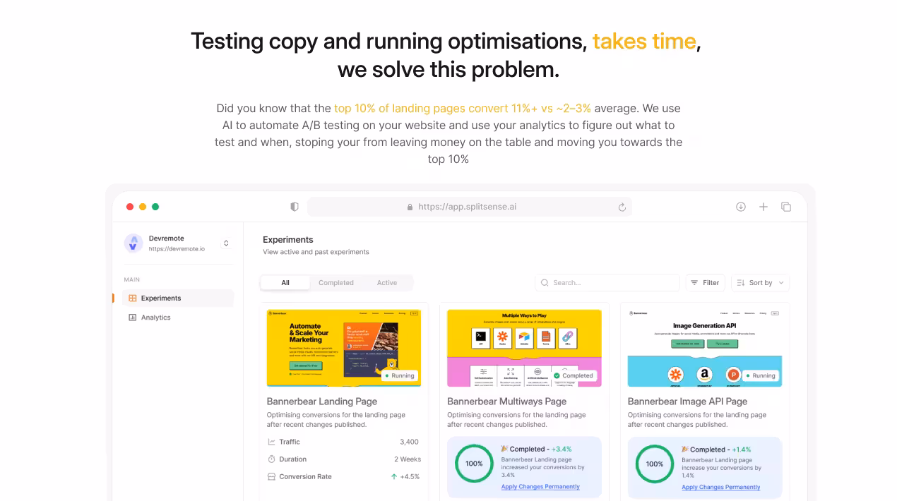
- If you lack a dedicated CRO team, consider tools that automate the testing loop. Splitsense analyzes existing page copy, generates A/B test variations using AI, runs experiments, and selects winners automatically, so optimization compounds week over week without manual setup.
Practitioners on agency teams echo the importance of aggressive testing. Aimers agency shared: “We stripped it back through our landing page design process, and their conversion rate jumped 47% in the first week. Less is genuinely more. The data doesn’t lie.”
Watch out for this: A contrarian but useful perspective from Default.com: “Best practices are an aggregation of what’s worked, on a surface level, at various companies. They tell you nothing about your target audience and their buying intent.” The takeaway isn’t that best practices are useless. It’s that they’re starting hypotheses for your own testing, not final answers.
13. Use a Proven Page Structure
Across hundreds of high-converting SaaS landing pages, the same section order keeps appearing. This isn’t coincidence. It maps to how buyers process information: attention first, then trust, then understanding, then decision.
Recommended section order:
- Hero section (benefit-driven headline, CTA, product visual)
- Social proof bar (customer logos, star rating, or user count)
- Problem/pain section (articulate the problem you solve)
- Features mapped to benefits (not features alone)
- Detailed testimonials (specific, with names and results)
- How it works (3 steps or a short demo)
- Pricing (if applicable)
- FAQ and objection handling
- Final CTA (repeat the primary action)
ThunderClap, an agency that has audited hundreds of SaaS landing pages, observed: “Teams pour budget into ads but then lose 90% of their visitors on the first touchpoint.” A structured page that guides visitors from awareness to action addresses this problem directly.
Want to see how your current structure compares? A free landing page review can identify the structural gaps that are costing you conversions.
Watch out for this: This order isn’t sacred. If your product has strong brand recognition, you can skip the problem section. If you sell to developers, they may prefer documentation links over testimonials. Adapt the framework to your buyer.
14. Make Your Page Scannable
Eye-tracking research from KlientBoost shows that users read web pages in an F-shaped pattern, scanning the left side and top of the page first before deciding whether to read deeper. If your key messages aren’t in the scanning path, they effectively don’t exist.
A single percentage point of conversion improvement on a page receiving 50,000 monthly visitors translates to 500 additional conversions per month. Scannability is how you ensure the right messages reach the right eyeballs.
How to implement:
- Use short paragraphs, 2–4 sentences maximum.
- Break up text with subheadings every 150–300 words.
- Use bullet points for feature lists and benefit summaries.
- Add white space generously. Cramped pages feel overwhelming and increase bounce rates.
- Bold key phrases that communicate value so scanners catch them without reading every word.
- Use visual anchors (icons, images, contrasting background blocks) to guide the eye down the page.
- Left-align body text. Centered copy is harder to scan and slower to read.
Watch out for this: Scannability and thoroughness aren’t opposites. A 2,000-word landing page can scan beautifully if the visual hierarchy is clear. The goal isn’t less content. It’s better-organized content that rewards both skimmers and careful readers.
Closing the Gap
The difference between a 3.8% conversion rate and an 11.6% conversion rate isn’t one silver bullet. It’s the compound effect of getting a dozen things right at the same time: a clear headline, simple copy, one focused CTA, layered social proof, fast load times, mobile optimization, and continuous testing.
The most important lesson across all 14 SaaS landing page best practices: these are starting points, not finish lines. Every practice here should be tested against your specific audience, product, and traffic sources. What works for a $50/month project management tool may fail for a $50,000/year enterprise security platform.
Two free ways to start today:
- Audit your current landing page against these best practices and get a specific diagnosis.
- Generate optimized copy variants using proven conversion frameworks like PAS and AIDA.
When you’re ready to move from manual optimization to continuous, AI-driven testing, Splitsense automates the entire loop: analyzing your page, generating variations, running experiments, and selecting winners so your conversion rate improves week after week without the manual effort.
For more conversion optimization strategies, explore the Splitsense blog.
Frequently Asked Questions
What is a good conversion rate for a SaaS landing page?
The median SaaS landing page converts at 3.8%, according to Unbounce’s analysis of 57 million conversions. The top 25% of SaaS pages hit 11.6% or higher. If your page converts above 6%, you’re above average. If you’re below 3%, there are likely quick wins available from the practices in this guide, particularly around headline clarity, form field reduction, and CTA focus.
How many CTAs should a SaaS landing page have?
One. Research shows that reducing the number of CTAs to a single CTA increased conversion rates by 266%. Repeat that one CTA at multiple points on the page (hero, mid-page, bottom), but keep the action identical. The exception is personalized CTAs that change based on visitor behavior, which convert 202% better than generic ones.
Should I show pricing on my SaaS landing page?
In most cases, yes. Adding visible pricing increases conversion rates by 20–30% and reduces sales cycles by up to 30%. Hiding pricing sends visitors to competitor pages where pricing is transparent. If your pricing requires custom quotes, show starting prices or ranges so visitors can self-qualify.
How long should a SaaS landing page be?
There’s no universal answer, but high-converting SaaS pages typically include the nine sections outlined in practice #13: hero, social proof, problem, features, testimonials, how it works, pricing, FAQ, and final CTA. Longer pages often outperform shorter ones for complex or high-ticket products because they address more objections. The key is scannability, not brevity.
Does page speed really affect SaaS landing page conversions?
Significantly. A 1-second delay reduces conversions by 7%, and pages loading in under 1.5 seconds convert 2.4 times better than pages loading in 4 seconds. For SaaS pages running paid traffic, slow load times also hurt Quality Score on ad platforms, raising your cost per click. Speed optimization offers one of the highest ROI-to-effort ratios of any landing page change.
How often should I A/B test my SaaS landing page?
Continuously, if your traffic supports it. Only 13% of A/B tests produce statistically significant results, which means volume matters. Companies like Thinkific tested over 700 landing page variations in under two years to achieve meaningful gains. Focus tests on the four highest-impact elements: headline, hero image, primary CTA, and form length.
What’s the most overlooked SaaS landing page best practice?
Copy readability. Pages written at a 5th–7th grade reading level convert at 11.1%, which is 56% better than 8th–9th grade content and more than double the rate of professional-level writing at 5.3%. Most B2B SaaS marketers write at a level that’s far too complex for peak conversions. Run your copy through a readability checker and simplify until you hit grade 6–7.
Should I remove navigation from my SaaS landing page?
For dedicated campaign landing pages receiving paid traffic, yes. HubSpot’s testing showed that removing navigation increased conversions by up to 28%. For your homepage or pages serving multiple purposes, navigation remains necessary for both user experience and search engine crawlability. Match your approach to the page’s goal: if it has one job, remove everything that competes with that job.
Get started with Splitsense, an Agentic CRO agent that opitmises your website for conversions on autopilot